
The Best Free Handwriting Font for Kindergarten
When we teach handwriting or how to form letters in kindergarten – it’s easy to focus on the wrong things.
Let me help you teach handwriting more simply with the best handwriting font for kindergarten.

In kindergarten, teaching handwriting is super simple.
Think that’s a loaded statement? I’ll break it down and show you what I mean and then I’ll teach you how to use the best handwriting font to your advantage.
And the neat part — you can pretty much kiss those handwriting books and stacks of worksheets goodbye.
Why it works
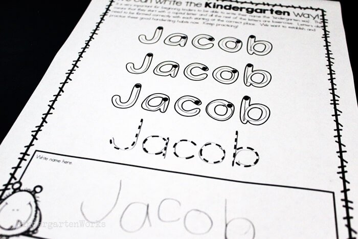
Here is a free font that I created just for kindergarten. I used it mainly to teach how to form the letters.
It’s unique since it shows students where to start their handwriting strokes and gives them a pathway to trace within instead of a dotted line to trace on top of.
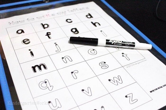
There is a dot to show students where to start.
If there is more than one stroke (they have to lift their pencil off the paper) then there is more than one dot.
Think of it like driving – they have to stay within the boundaries of the road. Don’t drive on the grass!
Here are some introducing letter strokes posters and worksheets that cover the basics made with this style of font.
So many letters are formed similarly it makes grouping them together easy.

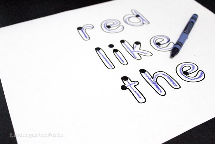
This font is the best for teaching students how to properly write their names (check out this name sheet).
I’d consider it a tracing font that will remind you of a Handwriting Without Tears style based on the fact that the letters show beginning dots.
Want to download this font to use in your classroom?
[terms of use – personal use only] [How to Install a Font] *Mac users – try Safari, not Chrome
Now, if that simple font combined with understanding how letters are formed doesn’t make handwriting easy… then we may just not understand what handwriting is in kindergarten.
Let me explain.
Handwriting in kindergarten
What it isn’t
Let me start with sharing what I think handwriting in kindergarten isn’t. I start here because I said earlier it’s easy to focus on the wrong things.
- Handwriting in kindergarten isn’t about writing in the traditional “lines” – you know the ones I’m talking about. The solid top and bottom line with a dotted line in the middle. Those lines have their place – but not in kindergarten.
- Handwriting isn’t about worksheets.
- Handwriting isn’t about neatness. Well, not entirely.
- Handwriting does not effectively teach letter identification or sound production.
And I don’t care if you don’t agree – or the handwriting curriculum company doesn’t agree. I’m the one who has to teach it to these young people – a skill they will use for their ENTIRE life. How I teach this – matters.
Plus, I learned from personal experience how easy it is to over-work this area of the curriculum and make some kids hate school “work.” {sigh}
What it is
So, now I’ve cleared up what handwriting isn’t – let me share the simple beauty in what it is in kindergarten.
Handwriting is teaching kids how to form letters with correct directions of pencil strokes so it leads to writing letters fluidly now and later in life.
That’s it.
It’s about the formation.
The cool thing is that it helps strengthen writers in kindergarten when they are ready to write with letter strings, phonetically spelled words, sight words and more.
What is developmentally appropriate
I’ve got an opinion about what is developmentally appropriate for 5-6-year-olds in regard to handwriting. Here’s my list:
- The proper handgrip is appropriate for kindergartners to learn.
- Understanding that each letter has a specific way it’s formed – is appropriate.
- Understanding that many letters have a pattern in the way they are formed – is appropriate.
- Using a rectangular box versus the traditional “handwriting lines” is appropriate to help teach space definition as needed. But not all students need this. It’s why you see me use a rectangle in place of the “name” line on the top of any paperwork.
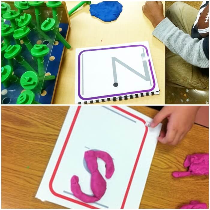
- Using tools to practice letter formations (pencil, crayon, markers, dry-erase, playdough, wikki stix) are age-appropriate.
If we take all that is appropriate about handwriting in kindergarten – then our instruction becomes pretty simple.
Ways to use this font
Let’s put that together and make it work for you with this handy-dandy new font you’re armed with now.
To support them in learning those strokes – give students a visual starting place. This way they will know where to form the letters until it comes naturally – and it will!
The beauty in this handwriting font is that it has the starting dots to support teaching those strokes.
It is the most simple and yet effective tweak to teaching handwriting. It’s not designed to use forever – it’s a tool to support them until they do it on their own.
When they know where to start – creating or following the path to form the letter becomes simplified and routine.
Remember I said earlier you could pretty much ditch the handwriting curriculum and worksheets? Well, that doesn’t mean this will teach itself.
Students still need to practice – but they won’t need to practice in the same traditional ways we’ve come to learn as “handwriting.”
I did use a small set of “worksheets.”
Let me list them for you. We practiced:
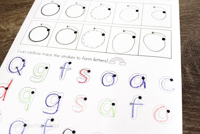
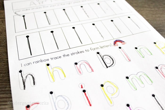
- names (everyone had their own sheet… and if they were proficient they worked on their last name)
- rainbow book (letters from A-Z… think of this as replacing the traditional “workbooks” and it teaches the order of strokes/dots)
- forming letters (using these free pages I made… there’s only 3!)
- small group testing sheet (laminated and used with dry-erase markers… students only worked on the letters they needed to master)
And we even worked on forming letters using playdough work cards in the playdough literacy center.
Then the rest was all application and helping students whenever they were writing as needed.
But, you know, we already do that naturally.
When handwriting isn’t a separate thing and just part of “how we write” then you’re using your time and talents as the teacher most effectively.
Conclusion
I hope this free tracing font and understanding how to teach forming letters by their strokes can help you teach your best.
Want this font without the starting dots? Then grab this handwriting outline font for your teaching arsenal.
Let’s continue breaking this down and find out how to teach handwriting in kindergarten.
If you like what I do here on KindergartenWorks, then be sure to subscribe today. I look forward to sharing ideas with you weekly.

Love this and so keen to use it but having trouble installing the font on my mac (I’m getting an Error message 79 – Inappropriate file type or format) – no idea how to fix or go about it! Help me please? Perhaps email me the ttf file? Thanksssss
Hi, I am trying to install the starting dots font and am getting an error code that says its an inappropriate file type or format. The one without dots worked great, just not this one.
I love this resource, I hope you can help me get it to work!
Maybe try again with a fresh download? Unzip the file and then copy and paste the font file into your fonts folder again. Sometimes I wish I knew why technology didn’t work like we expect it to!
Thank you for your generosity, I thought I’ll take forever to find this font!!
Do you have a link for the little video that shows in the corner ? Your voice saying the stokes as you form the letters ? It’s perfect.
I sure do! You can see the entire video here: https://www.kindergartenworks.com/kindergarten-teaching-ideas/breaking-handwriting-down/#songs
Hi Leslie – could you add a new link to download starting dots? The one embedded on your post is not expanding from the zip file when downloaded. Thanks for this awesome font!
I found that opening it in Safari helped for those who are mac users. When I opened in chrome the file wouldn’t open. 😀
Love the font and the tips on this website! 😀
Huh! Same issue. Thanks. Looks like there’s a dropbox re-direct that safari handles well but chrome doesn’t.
I’m unable to download this font. I get to the install font button on font book (Mac user), the screen flickers a few times, but does not install. Tried multiple times on 2 browsers. Any advice?
hi Leslie, your zipped file cannot be unzipped, it says there’s an error with the file format.
You might want to give it another try – sometimes computers can just be finicky. You could also try another browser or device to see if that helps. Right next to the download button there is also a link to more troubleshooting help.
– Leslie
Hi! I had the same problem. I checked the FAQ and the fonts file just cannot be opened it says “inappropriate file type or format”.
Me again! I have solved the problem! I am a MAC user and the download worked from Safari NOT Chrome.
Thank you!
Thanks for sharing your solution Avery – wouldn’t it be nice if all technology played nicely together? 😉 Hopefully this can help someone else in the same boat.
– Leslie
Thanks Avery, this made it work for me too!
Megan – you were so right! I literally just made some changes to that download button the day before and acidentally copied the wrong download URL. My apologies. It’s working and available now.
Thanks,
Leslie
I love love love this font for teaching formation. I would love to use it with some kids who have learned most of their letters with proper formation and are ready to begin working on line placement and letter sizing while continuing to practice tricky letters. The only problem with this is that the small letters, fall letters, and tall letters are not proportional (For example, the small letters are 2/3 the size of the tall letters, the falling letters don’t fall enough to go under any sort of line I could add. I have tried taking screenshots of letters and resizing them to get the heights I am looking for, but then it looks awful. Is there any chance you might consider making the outline font with more accurate letter sizes? I am sure that is a lot to ask for, but I thought I would try since otherwise I will need to find a way to create something along these lines myself and I have not been very successful in my past font creation attempts). Thank you again so much for this wonderful font!
I have now made outlines of the letters but would love any advice you might be able to offer with regards to creating a font! Last time I made letters that looked great, tried to make a font, and then all the letters were on top of each other with no spacing whatsoever lol. Any help would be greatly appreciated!!
I think there is a good font-making app you can find in the app store! It’s worth checking into because it would make the process easier.
– Leslie
Oh, how I wish I had found you sooner. You are incredibly talented st what you do! Thanks for sharing your gifts!
This is extremely helpful and my preschool kid really likes it.
Is one or two strokes used for these letters: ‘a’, ‘d’, ‘g’, ‘p’, ‘b’. ‘q’ ? The mechanics are different in the ‘Rainbow Book’ vs the ‘Outline’ font. The ‘Rainbow Book’ has two dots suggesting two strokes. The ‘Outline’ font only has one dot suggesting it is 1 stroke.
Glad to hear that Jordan. The letters you listed – I teach them all to have one stroke. I understand that it is different, but the rainbow book was also made by someone else so that accounts for the differences. I also couldn’t make multiple dots in the font (because fonts can’t have multiple colors) so that kinda explains another difference you’ll see between the two, but with perhaps other letters. I teach one smooth stroke because it lends itself to cursive later on!
– Leslie
I am trying to install the font but my computer keeps saying it “isn’t a valid font.” Help!!
Hi Kim – no problem.
If you download the entire zipped folder, then you’ll need to unzip it first. You can see how to do that here: https://www.kindergartenworks.com/zipped-files-explained/. Then you’ll just want to install the .ttf file in your font folder. 😉 If you try to install the whole folder you downloaded, it can’t install the terms of use pdf too, which is why it gives the “not a valid font” error.
Thanks! I hope you get a lot of great use out of it.
– Leslie
I’m having trouble with the Starting Dots link taking me to Dropbox — from there into an infinite loop with opening a pdf. I can’t seem to download it no matter what I do! I love your fonts and have never run into this before. Any suggestions? Thanks
Hi Katie,
Don’t click on the file to see what’s inside 😉 Okay – so click on the link in the post and then go directly to the “Download” button (next to the blue “sign in” button) and select “direct download.” I hope that can help!
Thanks,
Leslie
I think you should make a tshirt from your “I teach kinders how to….” at the bottom of your blog page. I would snap it up in a minute!!!
Thanks Karla – what a fun idea!
– Leslie
I found you via Freebie Friday at TBA. LOVE your fonts, especially New Fringe ! I’m a fontaholic! Thanks for generously sharing them! Downloaded and already installed <3
Thanks Angela! I’m right with you and the fontaholic-itis syndrome 😉
– Leslie